Data Visualization
Data Design
A series of data visuals I’ve created for various clients.
Role
Creative Direction
Design
Client
Various
Creative Direction
Design
Client
Various
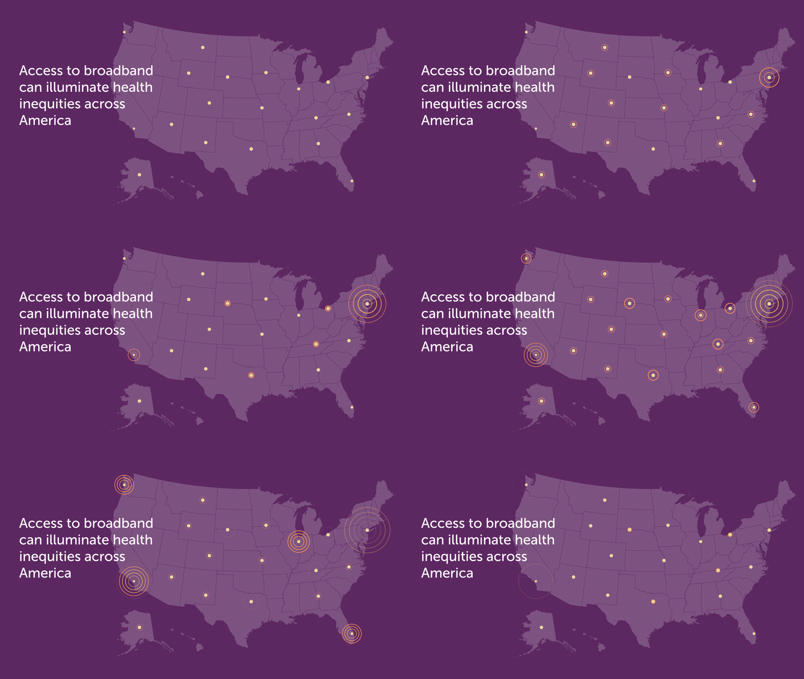
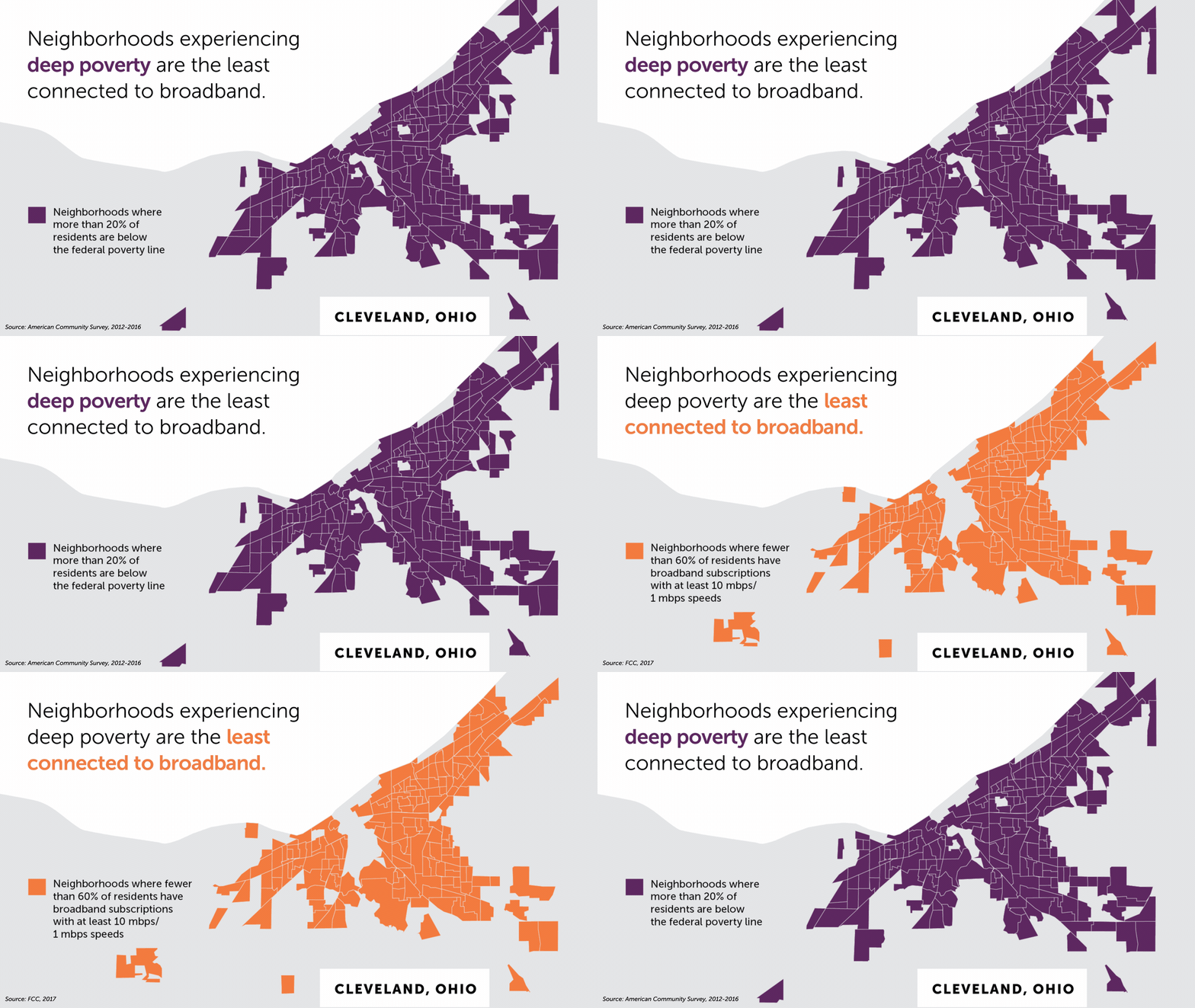
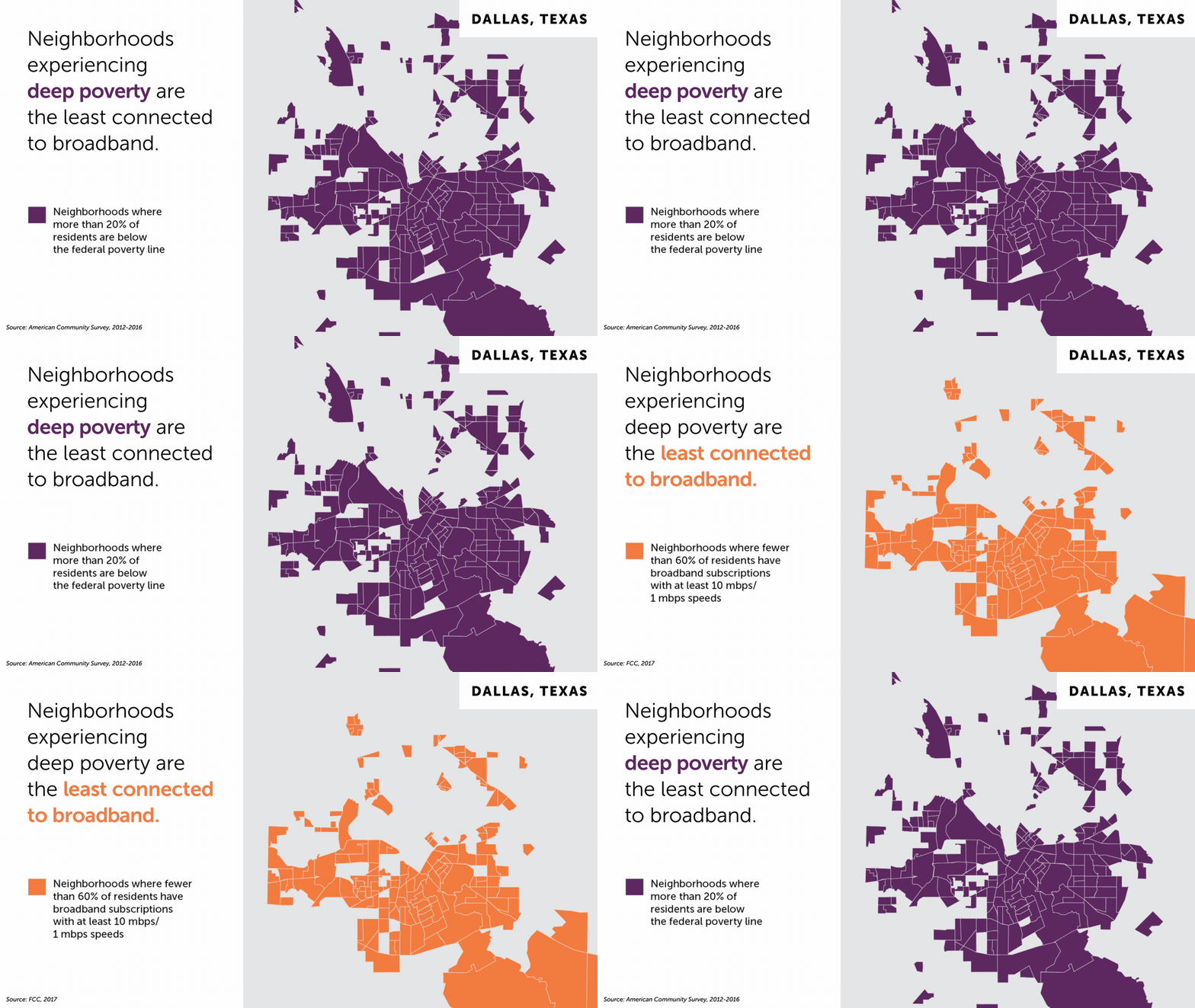
Working with the Robert Wood Johnson Foundation, I created this series of graphics for a social media story explaining the concept of digital redlining in cities throughout the United States.
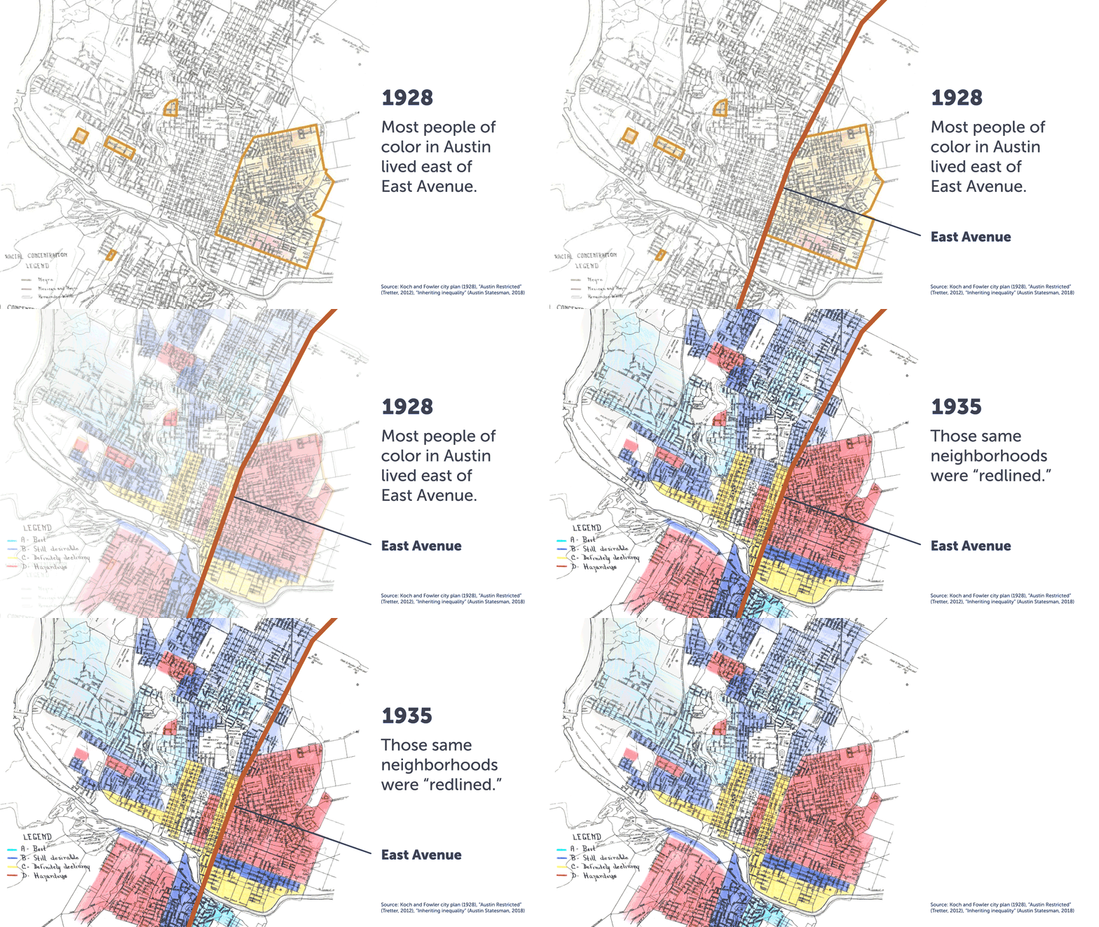
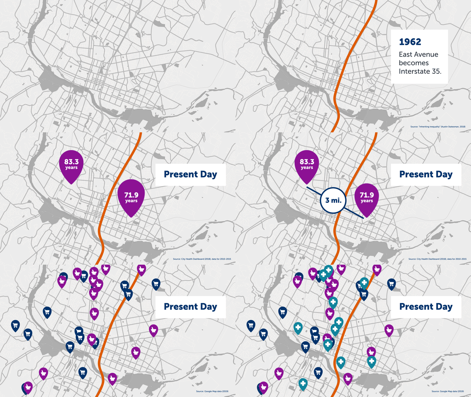
This series focused on how historical practices and policies, like redlining, still have an impact today on access to health care, healthy food, good jobs and how long people can expect to live.


As part of a digital campaign to promote healthy eating guidelines for children 2-8, Healthy Eating Research wanted to help parents visualize what appropriate portion sizes look like for each food group.
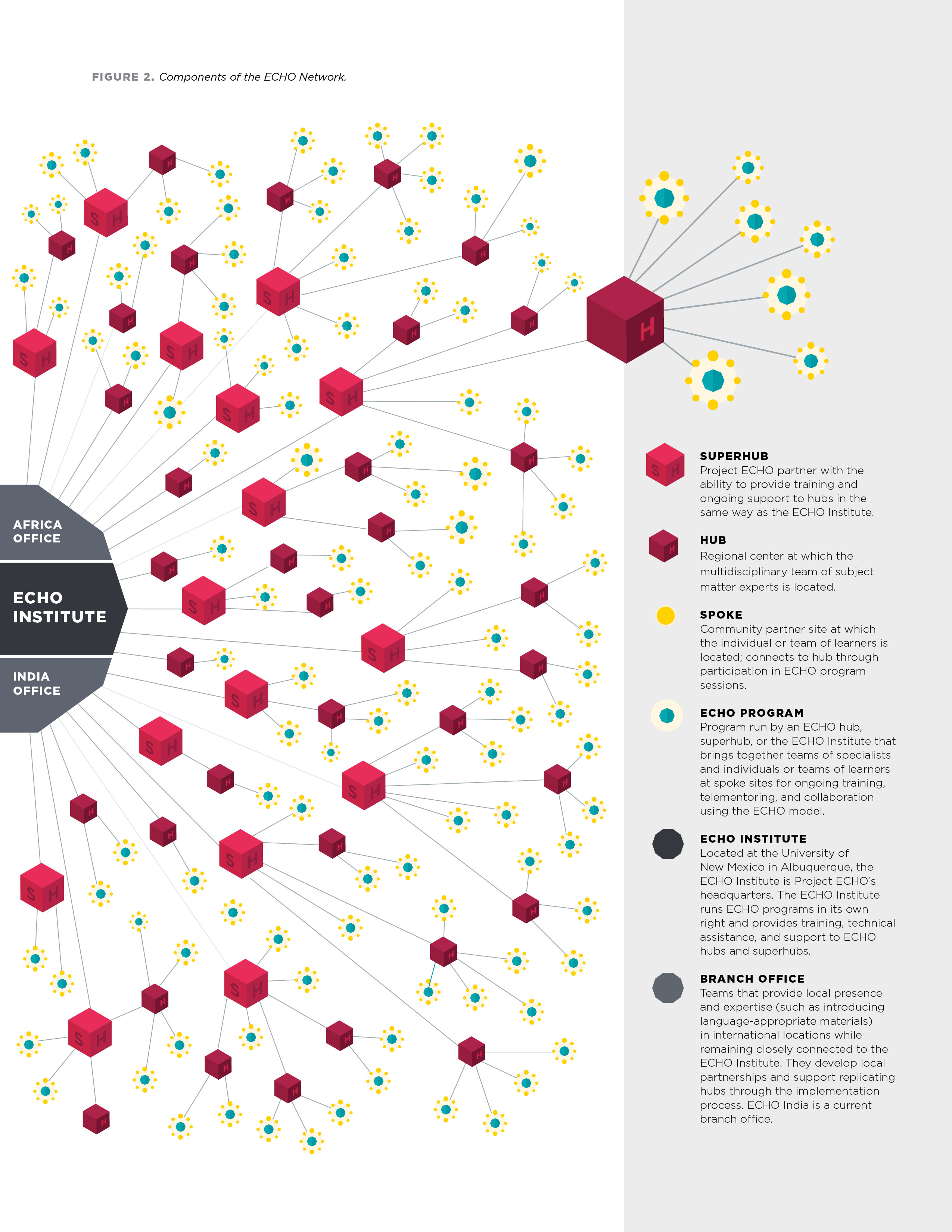
Project ECHO, a global telementoring organization for healthcare professionals, needed to communicate the vastness of their learning network built through hubs, spokes and programs. This visual modeled the relationships within the network while also showing how the network acts as a multiplier effect for moving knowledge.